Big Color Trends in Interior Design for 2020
From the avocado green and shag rugs of the 1960’s to the overstuffed sofas and lace doilies of the 1990’s, interior design trends are always changing. If you’re planning a big redecorating project for 2020, it helps to know what’s in style. Whether it’s colors, patterns or the types of art you put on the walls, you want your space to be modern without being so trendy that it quickly goes out of style again. Check out these interior color trends for 2020 to help you make the most of your interior design plans.
Don’t Be Afraid To Follow the Dark Color Trends
Neutral hues have traditionally been light colored. Of course, white is common in kitchens and bathrooms and for walls and ceilings. In past decades, even when interior designers wanted to go for a darker neutral, they typically choose light gray or shades of beige.
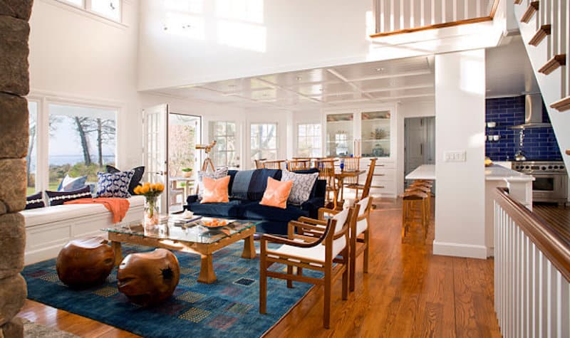
That won’t be the case in 2020. The start of the new decade will be all about being bold. In 2020, look for darker shades of gray and even black tones as the neutral tones for interior designs. If you want to go darker but not quite black, other popular options include navy blue and sage green. When employing dark shades, remember not to overdo it. If you’re using a darker shade for walls, for example, use lighter colors for your furniture and rugs. After all, you want the room to feel sophisticated, not like a black hole.
Bring Nature Indoors With Organic Shades
Maybe deeply sophisticated isn’t exactly your style. If you prefer lighter, airier interior decor, organic tones will be on trend in 2020 as well. These neutral tones of light gray and beige are reminiscent of forest and woods, adding a rustic appeal to homes even in the middle of the city. Mix these tones with one or two bright splashes of color if you like, but keep the overall look one of rustic elegance.

Consider the Generation Gap of Interior Color Trends
Maybe you’re curious about what other people your age are doing and want to stick to generational trends. Perhaps you just want to know what not to do based on your age. Understanding the Interior color trends among generations can help you determine whether you’re more like your peers or marching to the beat of your own drum.
Are you part of the boomer generation? People around your age typically still prefer white and beige. On the other hand, nearly 30% of people who are part of Generation Z love bright shades like orange and yellow, not to mention bold design patterns. Generations in the middle tend to fall somewhere…well, in the middle. Millennials in particular are starting to turn more toward deep, bold jewel-tones like shades of blue and purple.
Know That Beige Still Reigns as a Interior Design Color Trend
Beige was big in the 90’s and early 2000’s. It’s still popular in rental apartments where most landlords prefer to keep things neutral. Overall, though, the earth tone has gone the way of the dinosaurs. Or has it? Beige was once overpowered by the also neutral gray, but these days it’s making a comeback. Pair it with black or white for a natural look or navy blue or hunter green for something more dramatic. You can even get truly bold by mixing pops of neon into your otherwise neutral color scheme.

Add Some Champagne Colors To Your 2020 Interior Design
Yes, the bubbly is great, but that’s not what this style tip is referring to. When you’re considering your redecorating options for 2020, think in shades of champagne. This neutrally hued, beige-centered color is picking off all the grays of recent years. When paired with wood floors, deeper hues for the walls, and earthy decor, the tone creates a natural vibe that also works well with bolder textures. If you must go glam, add metallic accessories in silver or gold.
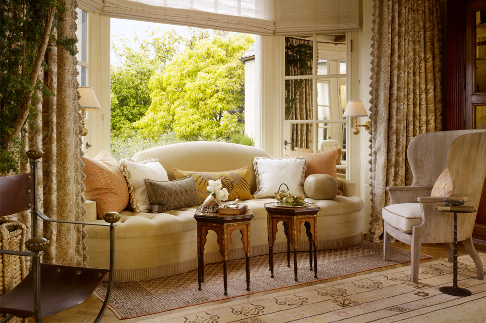
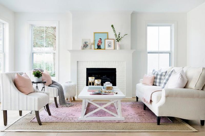
Try Something Frilly With Millennial Pink Colors For Your Decor
Before the term “Millennial Pink” was coined, this rosy shade was simply referred to as “blush.” The light, pastel color is a classic that also lends its hand to modern decor. The delicate color looks amazing in chic home offices, nurseries and children’s rooms, or even kitchens and bathrooms. Try antique rugs in a darker shade of pink to help you make a look that’s more sophisticated. Add some purples and aquamarine tones to really pack a punch with your interior design ideas.

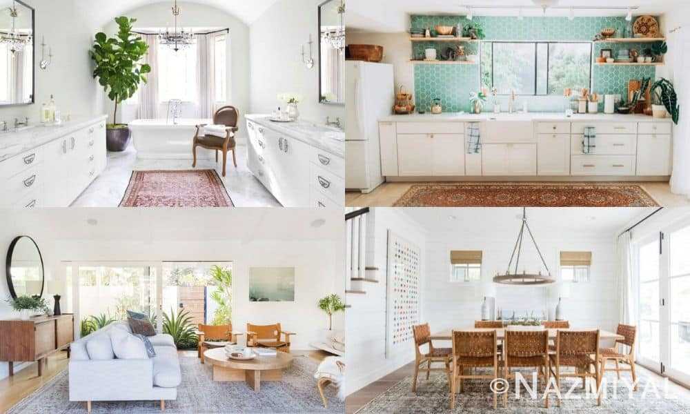
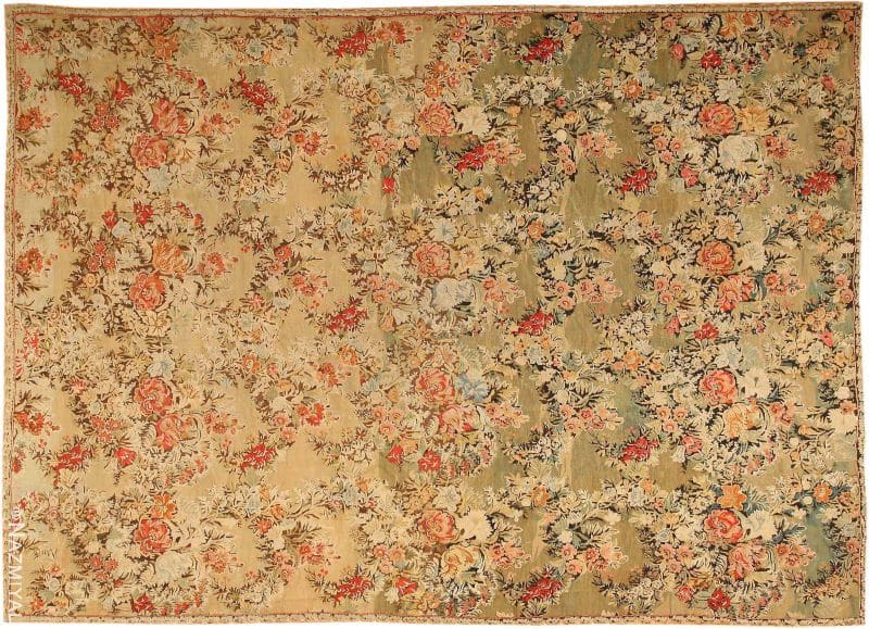
Of course, no matter what color scheme you decide to use for your interior decor in 2020, you want to make sure your floors match. Consider antique or modern rugs from the Nazmiyal Collection to help you get started. From basic colors to detailed patterns, antique rugs are available in all shapes and sizes to help you create exactly the look you want. The hardest part will be deciding which rug you’d like to purchase first.
General And Other Color Trends in Interior Design
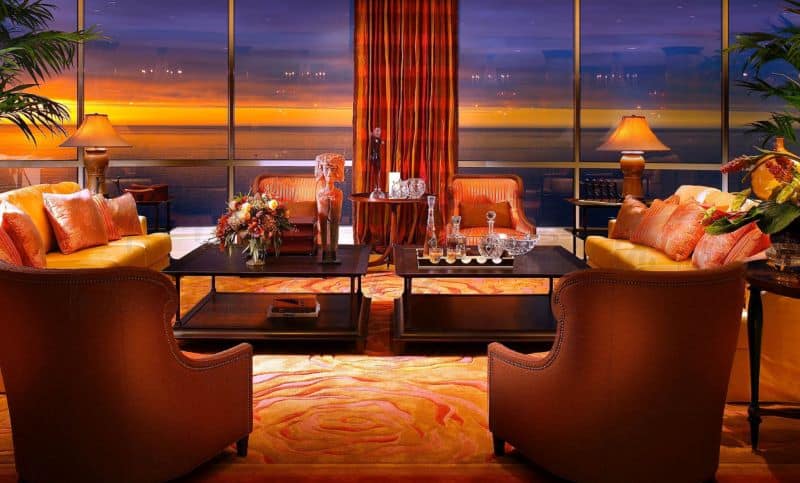
The days of bright and bold colored interiors are on the verge of moving into the slow-lane as autumnal and winter interior design colors trends become more and more evident. Some of our favorite hot color trends are reflecting the outside foliage changes with deep saturated colors of crimson reds, velvety browns, and rich ochres.
As the seasons change, home makeovers are in dire need of major face-lifts. Sure, it sounds a little whack-a-doodle to redo the entire design of your home just because the temps have dropped, but nothing gold can stay as Robert Frost once said. We are at a time in the year where there is no better excuse than to overhaul that design and style and thread with the time-shifting trends.
Color Trends for Your Gender Neutral Home Interior
So you are thinking of giving your home a face lift just in time for the fall? Why not take a leaf from the world of fashion and go with a gender neutral coloration?
This fall is going to be all about color combinations that are gender neutral. Cool, comforting, confident and elegant, these colors are equally good for your home’s interior decoration. In homes everywhere, you will be seeing a lot of desert sage, stormy weather, oak buff and other androgynous colors.

So with that said, here are 5 gender neutral fabulous fall color trends for your home:
1. Desert sage: A cool and soothing greenish-gray, desert sage will serve as the ideal neutral color for your home this fall. It is powerful yet unobtrusive, timeless yet just right for the season, and man-made yet uncannily natural.

Whether you use it to paint the inner walls or outer walls, this color makes its own statement. It makes a good combination with stormy weather and oak buff.
2. Stormy weather: If you are looking for a neutral color that is cool and dependable, then you should go with stormy weather. Reminiscent of a gray, overcast sky, this blue-gray color exudes quality and luxury.

Great for painting special designated areas, it makes a perfect background for modern and contemporary furniture. You can combine desert sage and oak buff to create a very cool and classy ambiance.
3. Oak Buff: The golden-yellow oak buff is mellow, warm and comforting. A naturally occurring shade, it brings good feelings and cheerfulness all over. Great for every room of the house, it provides a smooth and magnificent background for wood furniture, cabinets and sofa sets with leather upholstery.


During fall, it also happens to match with the color of the outdoor. Oak buff makes a great combination with desert sage and stormy weather.
4. Biscay Bay: Combining the tranquil qualities of blue with the invigorating aspects of green, Biscay bay is a great color of adding a cool and confident tone to your home. This lush and elegant variation of teal inspires thoughts of soothing tropical waters on a warm summer’s day.


Biscay bay goes very well with modern and contemporary furniture. It makes a beautiful combination with dried herb, a cool variation of olive green, and Marsala, an elegant wine red-brown color.
5. Cadmium orange: This brilliant color is one of the favorite colors of artists because it is both playful and sophisticated in its appeal. Popular in the 60’s and 70’s, it is making a big comeback this fall. When painted on a canvas or a wall, it evokes a sense of optimism, fun and fantasy.

Warm and welcoming, cadmium orange’s subtly dramatic hue is striking enough to make an impression on its own or as a bold contrast with another color. It can be combined beautifully with cashmere rose, or a luxurious shade of pink that is soft and creamy.
For best effects, these colors should be used in combination with one another and also with other colors. Some colors are excellent for background color, some for creating contrast and some as a pop of color.
Make sure to use the right combination to create the desired effect.
Here are our top interior design color trends for the seasonal change:
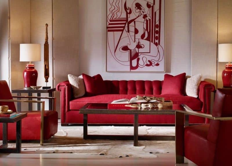
Crimson Red Colored Interior Design
This deep red is a wonderful color to fully bring in the color-shifting season of fall foliage. Adding a rich red into the mix of your wall color draws attention to any room and really brings in a dash of class. Not to mention, crimson is a type of red that doesn’t scream red-rum the moment you post it to your home’s walls. Crimson is a hot trending color that goes great with a multitude of neutrals drawn out in one’s furniture.
Chocolate Brown Color Interior Design
Chocolate brown is a classic staple in home decor that is making some serious splash this season. Something about this color just makes me think of long nights drinking a fine glass of wine in front of a blaring fireplace. Sure, it’s a pretty dark color that will shrink your space, but at the same time, will offer some serious cozy styling fully equipped with copious amounts of cuddling. When done right, chocolate brown can really set the mood and add a little spice to either light neutral furniture or enrich the deep “oakiness” of dark-stained wooden dining room or accent tables.

Ochre Color Interior Design
This color is rather difficult and can go awry if an incorrect shade is chosen. But, once you pick a perfect match, ochre becomes an unexpected pop of color that still trends the time aligning with seasonal changes. Ochre is a sure-fire way to grab attention and add a slice of unexpected beauty to a room especially for the creative types.

Interior Design Trends in Honeysuckle Pink Colors
With summer days of lounging by the pool or beach and summer nights of rooftop bar-hopping coming to a close soon, we decided that the time has come to brighten those moods and turn those sad dog puppy faces upside down.

We felt the need to remind you that this year’s hottest color trend for interior design comes as a pleasantly pink surprise that had homeowners reminiscing of sun-tea, sand castles, and lounging in lawn chairs with a good ol’ fashioned sun tan visor. Honeysuckle was the color of the year in 2011.This precious pink has been showing up in some major fashion collections, wedding motifs, and homes galore.

With its vibrant hue in the pink family, it comes as a bit of a surprise that this tone is serving up some serious trending action especially in today’s world of muted colors and monochromatic styling. Yes, honeysuckle is vibrant to the nth degree, but what the color does best is offer a homey feel and versatile styling choices. Whether you’ve decked out the den with this color or plastered the potty, honeysuckle is best at accommodating those hand-picked posies from the garden (or the flowers delivered from the local florist for us, New Yorkers).
An array of floral arrangements perfectly compliment this color and add a sprig of spring that will last throughout your year. Being in the red color family, honeysuckle really softens a room in a modern and contemporary chic status kind of way. Thus, the room is open and inviting making you want to sip your morning tea whilst reading the Huffington Post or relax with a bottle of kombucha post your morning yoga sesh.

I, myself am drawn to the neutral color palette of grays, blacks, and whites, with a slight pop in the warm color family, but I can appreciate honeysuckle for the modern mom and her stylish pad. There is something alluring about this color that just screams coming home to a plate of milk and cookies. I’ve never been overwhelmed with nostalgia induced by a color, but this little guy just really gets me.
Must be the real momma’s boy in me that can’t help to go back to the days when I was a wee little lad doing horrible magician tricks in my childhood home’s living room or playing cards (and cheating, of course) with my grandma at her house.

So, when you get tired of your prison-like cell of grays, slates, and charcoals, when you can’t bear to keep up with maintaining your pristine white hospital room, or when you need some serious change, get yo’ self some serious honeysuckle. The birds and the bees are incessantly drawn the flower, as I am sure you will have some serious attraction to your freshly coated home. Be sure to buzzzzzzzzz us with some pics!

The Recent Fall Trending Interior Design Color Palettes
First of all, let me just say that I am in complete disbelief that the Fall is slowly creeping around the corner. I like my days long, hot, and steamy where I can dine on outdoor patios without my fingers suffering from acute frostbite. (There is nothing cute about frostbite, FYI.)
Sure, the humidity hates gorgeous locks of voluminous hair. Yes, back-sweat makes everyone look like a marathon runner, but summer in New York City is jam-packed with so much to do and see, rooftops to be on top of, food to be grilled, and frolics through parks to be scampered. However, a boy can only dream of summer nights and days for so long until the leaves begin to turn and fall, breezes blow by shuddering up one’s spine, and the term, “layer”, comes back into play.

In order to prepare yourself for the imminent climate change, check out our trending interior design color palettes for fall:
Yes, it’s going to be fall and every single fall, some shade of orange is hot. Can you blame us though? When we see orange, we think pumpkins, sweet potatoes, turkey, leaves, etc. Orange is an autumnal staple. This year, cayenne brings more to the table than the Master Cleanse or Beyonce Diet. (Trust me, don’t even go there. I tried it once, and let’s just say misery was an understatement.)
All that being said, cayenne offers a gentle approach to the bursting vibrancy of the orange color palette and presents a homey feel that makes you want to curl up next to a fire. What we also love about cayenne is its versatility. Whether you’re painting the hallway, throwing down some pillows, or decking out the bathroom in all of cayenne’s glory, this color will brighten your home and make you feel all warm and fuzzy. Side effects may include: uncontrollable cravings for yams and pumpkin pie.
Trending Interior Design Color Trends and Palettes For Fall – green / Kiwi Colors
Green, yet another fine choice for an autumnal staple. This fall we are kind of obsessed with kiwi which will be a great complimentary color to that cayenne. Kiwi is a cooler shade of green that offers a little bite through its subtle vibrancy. This absolutely delicious color will liven a room even through drab nights and howling winds. Make sure to be sparse with kiwi perhaps using it in a throw, accent furniture, or table napkins.
Too much kiwi could transport your modern day loft to the island huts of Oahu. Be sure to steer clear of these volcanic eruptions unless living in a tiki hut is your thing.

Trending Interior Design Color Palettes For Fall – Purple / Eggplant Colors:
Last but not least on our favorite fall color palette is eggplant. This shade of purple is wonderful for decorating the modern chic apartment. Eggplant is a rich and hearty color that really gives a room a sense of sophistication, history, and not to mention, a sense of nobility.
Pairing this color with muted neutral tones of whites, greys, or tans can really add a touch of heft to this coming season’s colors. All of this talk about colors named after foods sure makes a guy hungry.

Color Trends for Your Home Interior design
It’s that time again, where leading paint specialists and trendsetters release their selections for the Colors of the Year, 2016. These suggestions predict what the interior design color trends will be inspiring interpretations among designers and your favorite home design stores in the New Year.
The great thing about these palettes is that they are soft, fashion-forward shades that will work in just about any room, color theme or style. A great way to incorporate these serene colors into your home is by using a rug or carpet.
Here are our tips:
Pantone, Rose Quartz & Serenity– This complimentary duo is the first color combination that has ever been selected. They were designed to bring peace and serenity to the home during these stressful times.
Pantone says the decision was based on emotion, “A symbolic color selection; a color snapshot of what we see taking place in our culture that serves as an expression of a mood and an attitude.
Glidden, Cappuccino White– Glidden has chosen to re-rempower the color white in a new iteration, making it a statement color for 2016. When asked to describe the new shade, paint color expert, Misty Yeomans says:
“As legendary fashion designer Tom Ford said, ‘Time and silence are the most luxurious things today’ In an age of constant interruption and chatter, Cappuccino White offers a soft backdrop that helps defer distractions ad creates a calm lightness in the home to encourage a relaxed mind”.
We recommend pairing this color with delicate pastels or light neutral colors.
Sherwin-Williams, Alabaster– Jackie Jordan, Color Marketing Director says:
“Alabaster represents a straightforward and necessary shift to mindfulness. It provides an oasis of calmness, spirituality and ‘less is more’ visual relief. Alabaster is neither stark nor overly warm, but rather an understated and alluring white.”
Benjamin Moore, Simply White– This color is all about appreciating the subtleties of white and the simple beauty of it’s interactions with light. It’s a contemporary, minimalist design approach and Benjamin Moore suggests using black accents for a high contrast effect. You can also try pairing with blush tones or wine undertones similar to Pantone color of the year to create a complementary interior design color trends palette across the board for 2016.
Crazy Vibrant Color Interior Design Trends
Vibrant Interior Design Color Trends – With the future fashion trends gracing the runways during the 2012 preview shows, where does this leave the world of interior design? Well, boy and girls, ladies and gents, designers and decorators, I have one thing to say, “You better work (in that color, that is). Crazy color choices are here, and they are here to stay for the modern man and / or woman. The days of simple color palettes are gone.
Rooms full of gunmetal grey, funeral black furniture, and cold steel accents — passe! Ugh, don’t even get me started on the bleach stained all white motif that wreaks cleanliness and sterility! You don’t live in a hospital, put the eggshell down, back away from the mother of pearl, and “marshmallow bunny white” must be some kind of joke.
(Sadly, said color actually exists.) Revamp that room with colors, my dears, bright vibrant colors that would make homeowners of West Chelsea scream, “Oh, my Gaga!”

I know this must come as a shocker to you as you read this post, hyperventilate, and breathe into a brown paper bag, BUT calm down, do a little Buddhist chant, and say teal, fuchsia, lemon, chartreuse, cyan, tangerine, and magenta.
Wow, that kind of sounds like a bowl of Trix cereal or a bag or Runts. Oh, whatever! What I am saying here is step out of the black box and liven up that living space with bursts of streaming colors.

Pastel Colored Interior Design Trends
Traditional classic colors for the spring come at no surprise that they would be full of enough pastel options that would make the Easter Bunny jealous. That being said, modern motifs have shown these traditional hues paired with harsher and more aggressive styling.
Sure, we can paint the wall soft pink, but trends forecasts are leaning towards incorporating severe pops of darker tones by juxtaposing said palette with tons and tons of black. Modern interior design is all about taking that classic or vintage look and updating it for today’s trendsetter.

Soft, subtle and always angelic, pastel rugs are for dreamers
Interior decorating with beautiful pastels and soft colored rugs:
Pastels; not just for the nursery, baby. Designers are bringing back these whimsical colors in sweet and subtle ways to give a heavenly feeling to your living space. And what better way to employ this dreamy trend than with pastel rugs? Incorporate this Spring palette into interiors with a Scandinavian influence, or to add a retro feel.
As for rugs, pastels can be found across the board, from vintage to antique rugs. Depending on your taste, you can find these colors in Turkish rugs, or through the magnificence of silk. Baby blue, light pink, and minty green are now the answer to a modern accent, often toned down with elements of black. So what do you say? Are you falling for the pastel come-back?
This interior design blog post about trending color palettes in interior design and home decor was published by Nazmiyal Rugs and Rugs in New York City.vvvv
The Best Color Combinations for Home Decor in 2020
If you’re decorating any part of your home, you’re probably interested in the current design trends and trends in color. Choosing the right color combination is key to making your interior design look perfect. Read on to see some of our favorite color combinations for this year that will leave your home looking perfect.
Peach and Blue Colors
First on the list is the stunning combination of peach and blue (or mint, turquoise, or other variations of blue if you’re feeling creative). Peach is a derivative of orange. On the color wheel, blue and orange are complementary colors, so you can be sure that not only is this combination objectively beautiful, but it scientifically goes together. This combination is more timeless than some of the other color combinations on the list. A muted, earth tone color mixed with a bright primary color is a trend that has shown up in some form or another for the past years. Whichever way you choose to incorporate it into your design, you can be sure it’s a beautiful look.
Sapphire and Cream Colors
More classy than playful, deep sapphire and soft cream is a stunning combination we’ve been seeing a lot of already in 2020. Jewel tones are seeing a resurgence in popularity in the recent months. Rich sapphire is not excluded from this trend. When combined with creamy off-white, the space feels fit for royalty. In color psychology, blue is known for being peaceful, as well as associated with intelligence. Powerful, deep blue hues like sapphire are perfect for an inspiring home office.

Gold and Moss Colors
Another royal color combination is metallic gold and mossy forest green. Earth toned greens like sage and moss have been wildly popular in interior design recently. Expand on this trend and take it from organic to polished by combining your green tones with gold decor accents. This stunning color combination seems unexpected at first, but is unique and luxurious. Make the combination even more lavish by choosing luxe textures, such as velvet, to contrast beautifully with shiny metallic accents. This is the perfect color combo for the trendsetters and lovers of classic opulent styles.
Blush and Olive Colors
Yet another of the color combinations for this year includes an earthy green tone. Muted, blush pink paired with earthy olive is an up and coming combination seen in the apartments and homes of many celebrities and trendsetters. This combination works best when it is used with lots of texture in the design. Incorporate lots of textiles into your space, like a shag rug, or a tapestry hung on the wall. Use tactile upholstery like velvet or corduroy. Drape throw pillows and blankets, and add in visual texture from other materials like wood, iron, and gold and silver metallics. Use this combination for an earthy vibe with a trendy, feminine touch.

These top color combinations all look stunning when used right in your space. Play around with different shades, amount of color, and textures until you find a look you love. If you need help finding the right rug for these color combinations, don’t hesitate to contact our team of experts, or browse our curated choices below.
Rugs from the Nazmiyal Collection that are perfect for these color combinations:


This interior design blog about the interior color trends of 2020 was published by Nazmiyal Antique Rugs.