Key Takeaways
- Warm palettes feel cozier and more intimate, especially in larger rooms or spaces with lots of hard surfaces.
- Balance matters: pair warm rugs with quiet walls and natural materials so the rug reads as intentional—not heavy.
- Look for quality color: abrash (natural variation) and well-chosen accents often signal thoughtful weaving and better long-term livability.
At-a-Glance Specs
- Palette: reds • rust • terracotta • gold • amber • warm ivory • walnut brown
- Common materials: wool pile • wool/silk highlights • flatwoven wool (kilims)
- Typical looks: allover florals • medallions • tribal geometry • tonal modern fields
- Best rooms: living rooms • dining rooms • libraries • bedrooms • warm-entry moments
- Typical sizes: runners for hallways • room-size 8×10+ • oversized statement rugs for open plans
- What to look for: clean contrast • consistent drawing • stable construction • comfortable pile height for your use case
Popular Searches
Large rugs | Oversized rugs | Shop by color | Rug size guide
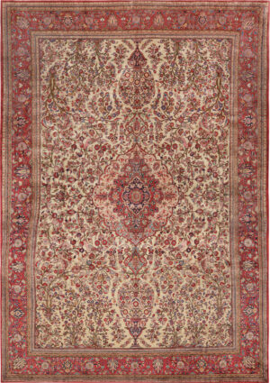
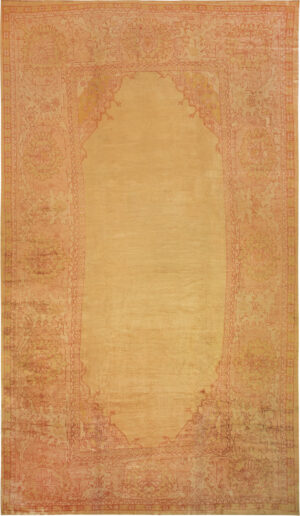
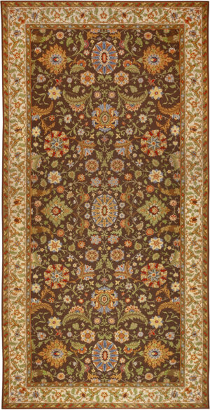
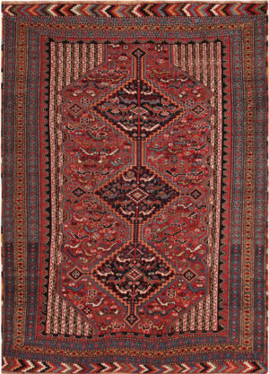
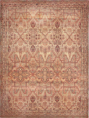
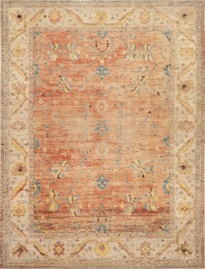
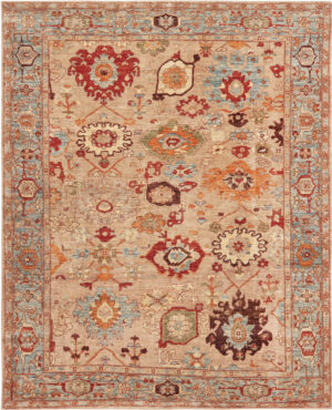
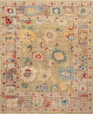
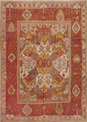
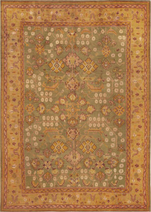
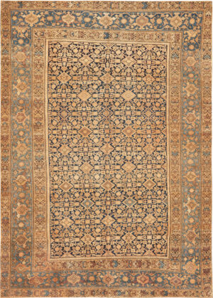
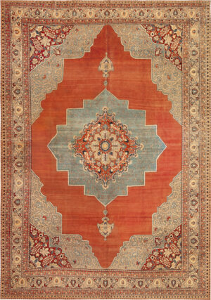
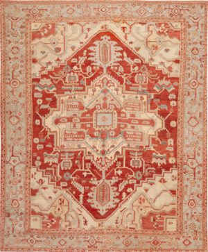
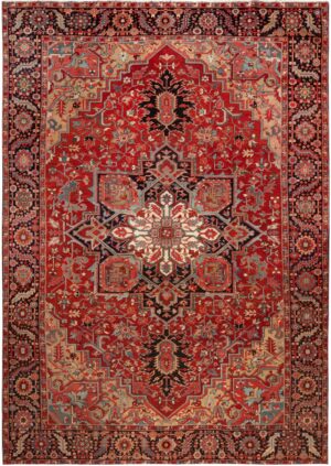
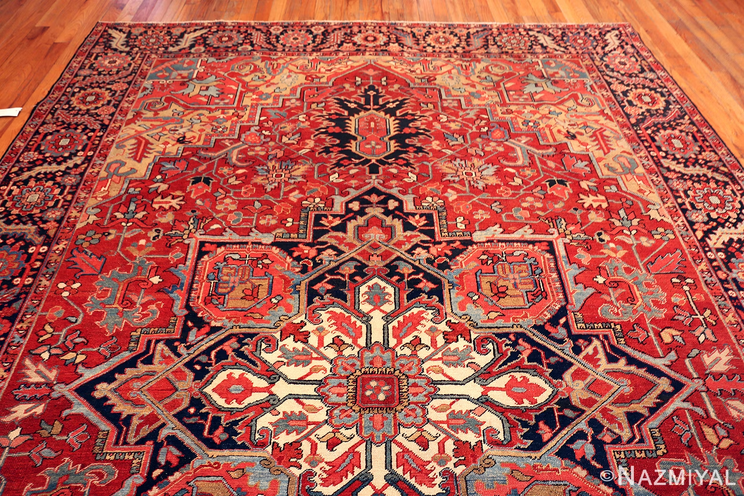
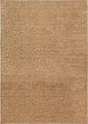
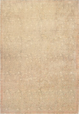
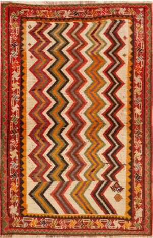
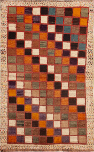
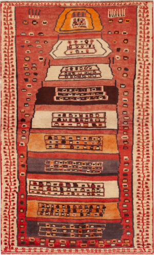
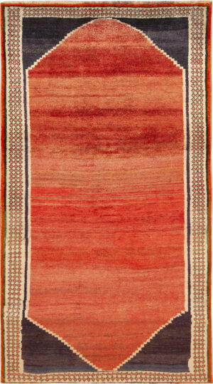
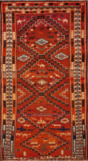
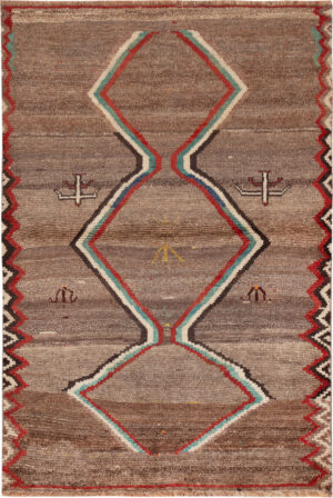
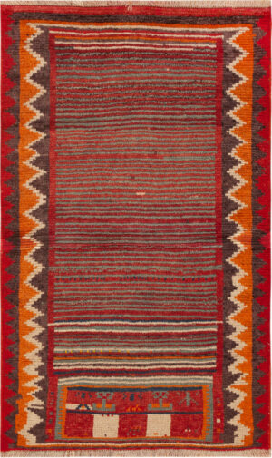
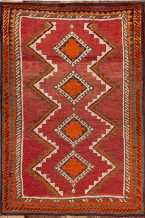
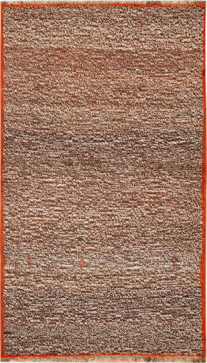
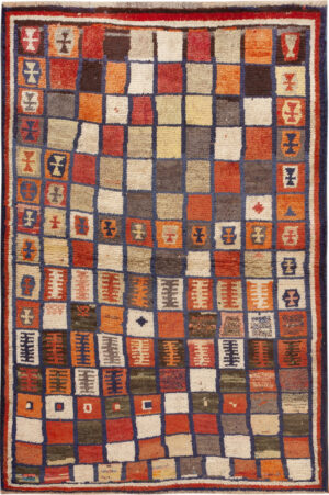
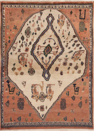
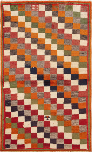
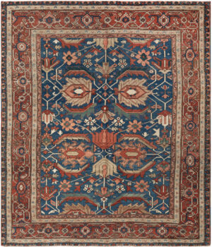
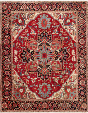
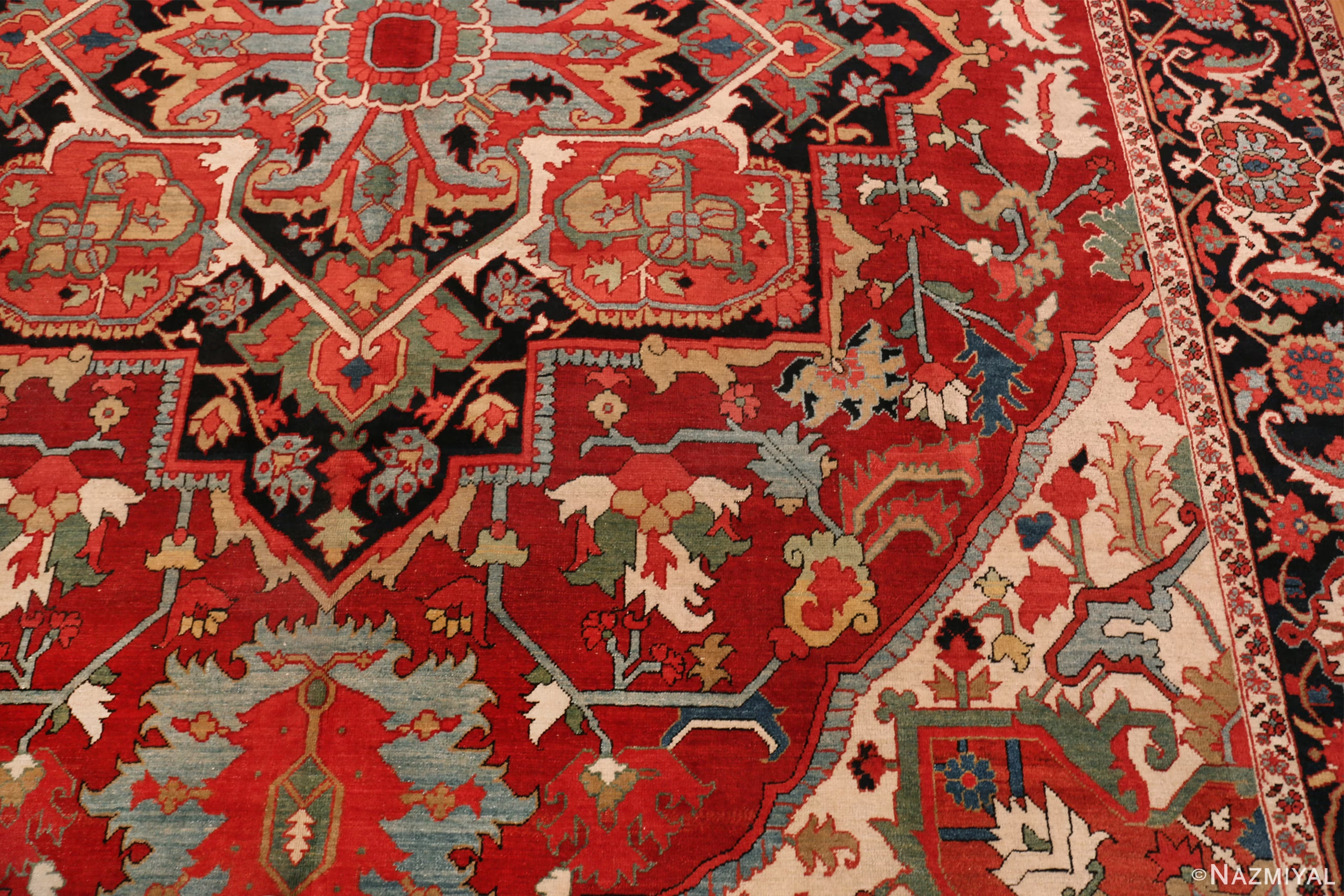
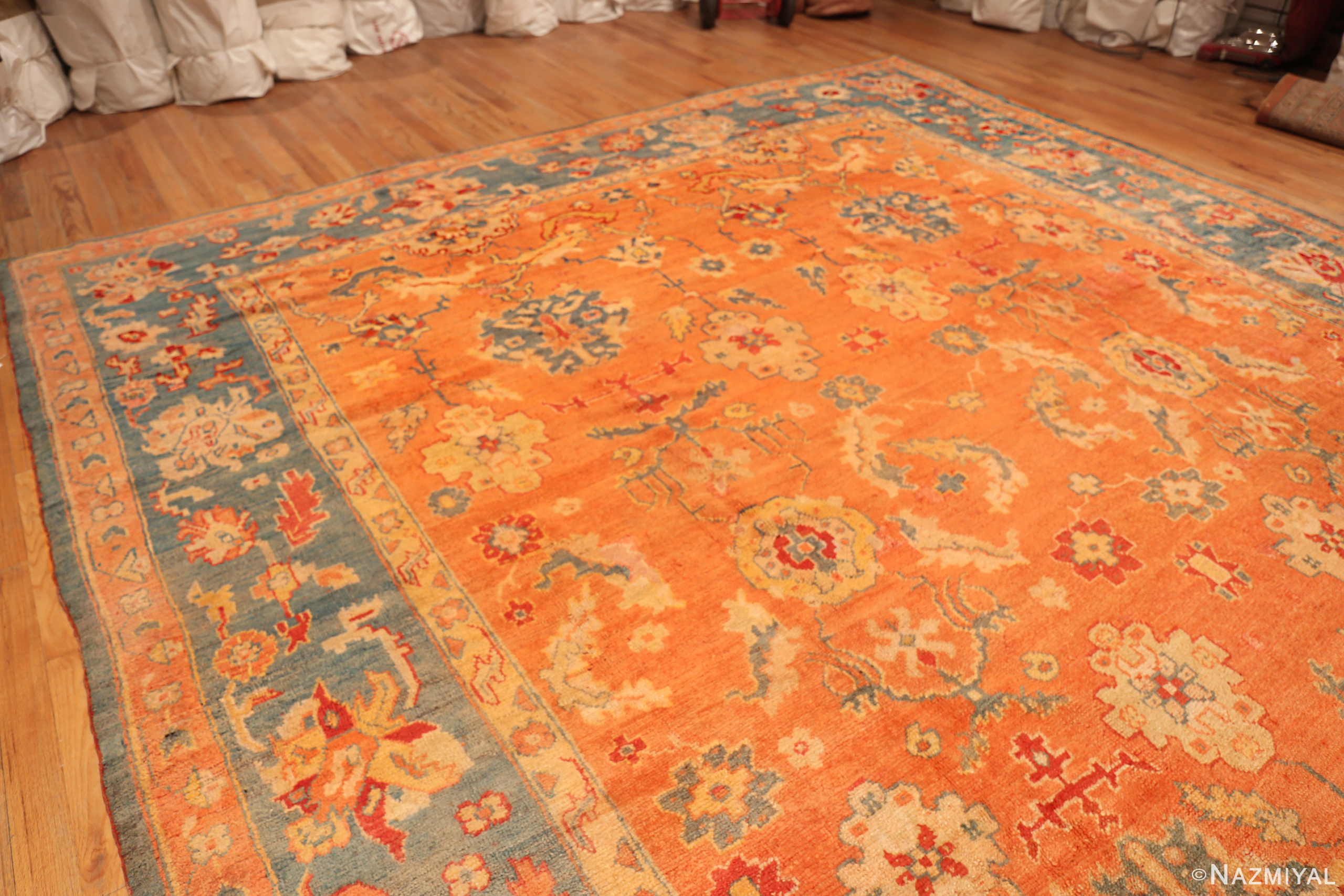
Featured Warm Tone Rugs from the Collection
Inventory changes frequently. These featured rugs are examples of warm palettes across different weaving traditions and eras.
Identification & Construction
How to recognize a warm-palette rug (beyond “it’s red”)
Warm tone rugs are usually built around one of two strategies: a warm ground (terracotta, rust, gold, warm ivory) with quieter motifs, or a neutral ground with warm accents used for structure (borders, medallions, corner spandrels). In traditional workshop rugs, warm notes often come from careful dye choices and controlled contrast; in tribal and village pieces, warm palettes may show more variation and lively color movement.
Materials, dye character, and what you’ll feel underfoot
Most warm palette rugs are wool-forward. Well-spun wool holds warm dyes beautifully and can show abrash (natural tonal variation) that makes the color feel more organic. Flatweaves (like kilims) tend to read more graphic and modern, while pile rugs tend to look deeper and more dimensional—especially when warm colors sit next to ivory or charcoal accents. If you like to shop by weaving family and region, explore Rug origins.
Decorating & Placement Guidance
Start with the room’s scale (warm colors can feel closer)
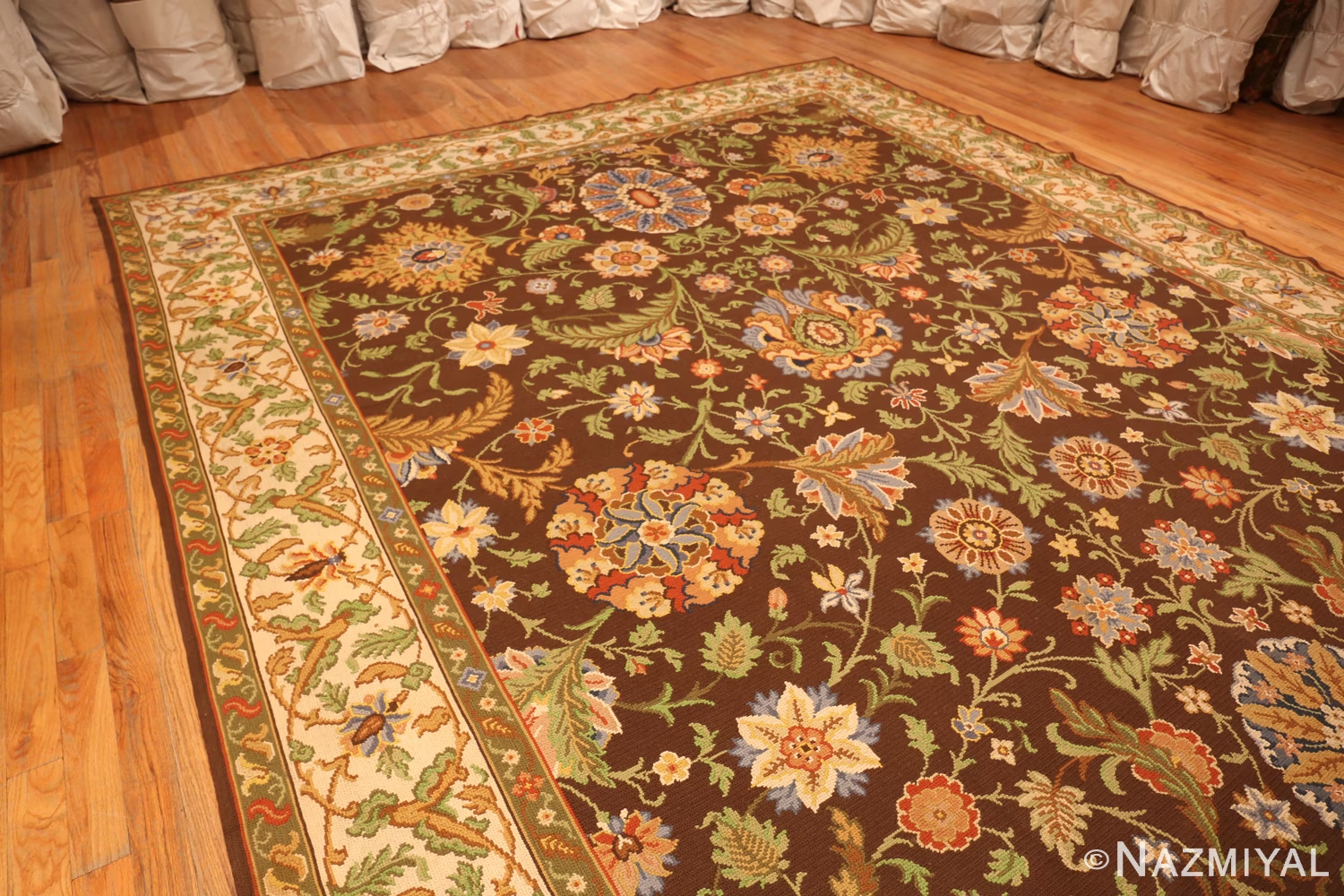
Warm palettes visually “advance,” which can make large rooms feel more cohesive—but can also make small rooms feel tighter if the rug is too dark or too busy. In compact spaces, consider a warm rug with a lighter ground or a more open pattern. In large rooms, warm tone rugs can be a unifying foundation—especially when paired with natural woods, stone, and layered textiles.
Layer warm color in a controlled way
Instead of making the rug do all the work, repeat your warm tone once or twice elsewhere (a throw, artwork, or a single upholstery accent). This keeps the room intentional without becoming monochrome. If you’re sensitive to texture changes underfoot, use pattern and contrast to create “visual texture” rather than stacking thick piles.
Match the era and mood to how you live
For classic, collected warmth, start with an antique rug in a grounded palette. If you want lived-in character and easier day-to-day decorating, explore vintage rugs. For cleaner lines and fewer competing motifs, a modern rug in warm neutrals can give you the glow without the visual density.
Rugs over carpeting: keep it stable and intentional
If you’re layering over wall-to-wall carpet, choose a rug that sits flat and feels supported. Low-pile rugs and flatweaves often behave better over plush carpeting than very thick piles. In any case, prioritize stability and a clean perimeter so the rug looks deliberate and stays safe.
Warm Tone Rugs vs Cool Rugs
If you’re deciding between “cozy and forward” versus “calm and expansive,” compare warm palettes with their closest counterpoint: Cool rugs.
| Feature | Warm Tone Rugs | Cool Rugs |
|---|
| Visual effect | Feels closer, cozier, more intimate | Feels calmer, airier, more expansive |
| Best for | Big rooms, north light, spaces with hard surfaces | Small rooms, brightening goals, crisp modern palettes |
| Typical pairings | Warm woods, brass, cream walls, earthy textiles | White/gray interiors, cooler stones, chrome, coastal hues |
| Common color notes | Red, rust, terracotta, gold, warm ivory, walnut | Blue, teal, green, violet, cool gray, icy neutrals |
Closest Cousins
Glossary
Warm tones: Reds, rusts, golds, and warm neutrals that feel inviting and visually “advance.”
Abrash: Natural tonal variation in dyed yarns that creates depth and movement.
Kilim: A flatwoven rug with a lighter, more graphic feel than pile rugs.
Ground color: The main background color that sets the rug’s overall mood.
For more definitions, see the Rug glossary.
FAQ
What colors count as “warm” in rugs?
Warm rug colors typically include red, rust, terracotta, orange, gold, amber, and warm ivory or beige. The overall effect matters more than any single accent color.
Do warm tone rugs make a room look smaller?
They can. Warm colors tend to feel closer, so in smaller rooms many people prefer a lighter ground color or a simpler pattern to keep the space open.
How do I keep a warm palette from feeling heavy?
Use contrast and breathing room: lighter walls, natural materials, and a rug design with open space or controlled pattern density helps the color read as rich, not dark.
Are warm tones common in Persian rugs?
Yes. Warm reds and rusts appear frequently in many weaving traditions, and they can be especially striking when balanced with ivory, indigo, or charcoal accents.
What’s the easiest way to “try” a warm palette without repainting?
Start with the rug and repeat one warm note elsewhere (a throw, art, or a single textile). This creates cohesion while keeping the room easy to evolve over time.
Nazmiyal White-Glove Service
We make it easy to shop with confidence—whether you’re choosing a single statement piece or curating a full room.