The Quiet White That Makes Everything Else Look Better
After 45 years of living with rugs (not just selling the – living with them), I’ve learned something simple: the most successful rooms don’t shout. They breathe.
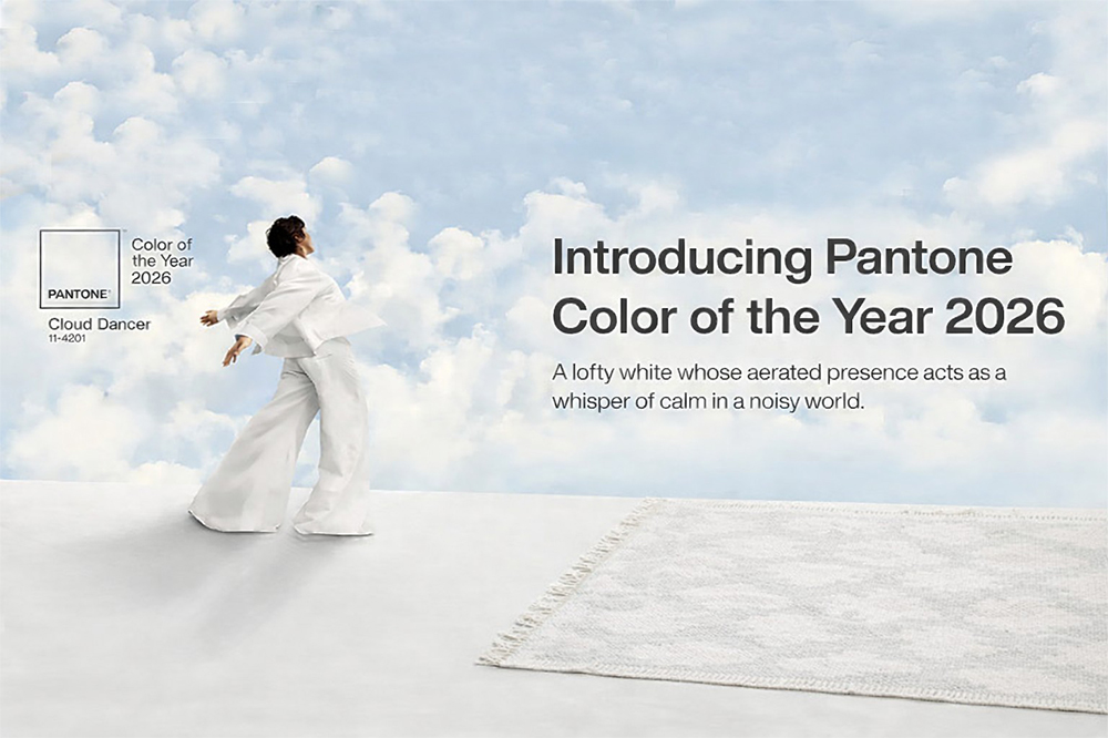
Pantone’s Color of the Year for 2026 is PANTONE 11-4201 “Cloud Dancer” – a soft, lofty white that’s meant to feel calming, clean, and weightless. (Pantone)
And yes, it’s “just white”… but it’s not the kind of white that feels clinical or flat. Cloud Dancer is the kind of white that works like good gallery lighting: it doesn’t steal the show – it makes everything you place against it look more intentional.
What exactly is “Cloud Dancer”?
Pantone describes Cloud Dancer as an airy, balanced white – chosen as a symbol of calm and clarity, a “reset” color for a noisy world.
Design-wise, what matters is this: it’s a white with presence. Not icy. Not chalky. Not stark. It sits in that sweet spot where warm and cool materials can both feel at home.
Why this color makes sense right now
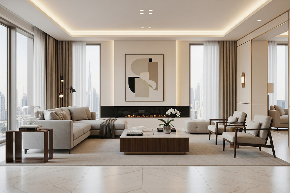
Cloud Dancer functions as a foundation color. As a result, it supports rooms built on texture and proportion. After decades of seeing what lasts, the smartest interiors stay calm above and expressive below.
“Cloud Dancer is part of that return to restful design: lighter rooms, fewer competing colors, more natural texture. And if you’ve been watching what’s happening in fashion and interiors, you’ve seen it too – cleaner palettes, softer neutrals, and materials doing the talking.” – Vogue
But here’s the key: a calm background doesn’t mean a boring room. It means the right pieces finally get the attention they deserve.
How to use Cloud Dancer without ending up with a “blank” house
1) Treat it as a backdrop, not the main event
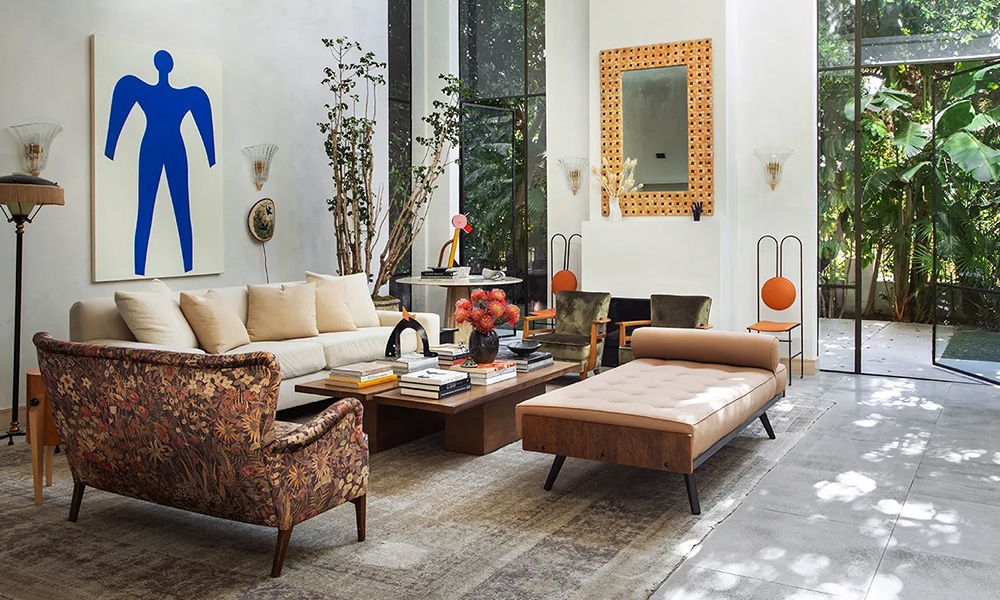
Cloud Dancer is best when it’s doing what great neutrals do: creating space for other elements – wood, stone, art, and especially textiles – to feel richer.
2) Layer texture like you mean it
If you go white-on-white, texture becomes your color:
- linen or wool drapery
- plaster finishes or limewash walls
- oak, walnut, or ebonized wood
- aged brass, iron, or bronze accents
- bouclé, mohair, nubby wools
That’s how you keep white from feeling sterile.
3) Let one “historic” piece carry the soul of the room
This is where antique rugs shine. A room can have modern furniture, contemporary art, clean-lined lighting – and the rug is the piece that makes it feel human. Cloud Dancer gives that rug the perfect stage.
Why Cloud Dancer is a dream pairing for antique rugs
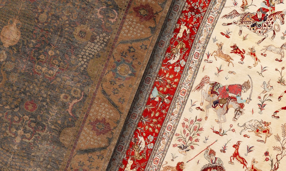
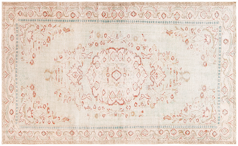
Antique rugs aren’t flat in color. They’re vegetable dyes, oxidation, patina, abrash, age, and time – the kind of beauty you can’t manufacture.
A soft white like Cloud Dancer does something special:
it makes those aged colors look more transparent and more dimensional.
Here are a few pairings I love (and I see them work in real homes every day):
Cloud Dancer + deep indigo and madder reds
Think classic Persian palettes – indigo grounds, brick reds, small touches of ivory. Against this shade, the red reads warmer, the indigo reads deeper, and the whole room feels “finished” without trying.
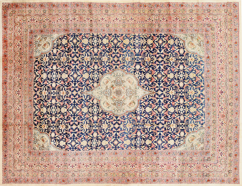
Cloud Dancer + camel, sand, and warm neutrals
Oushaks, certain Kermans, and aged room-size carpets don’t pop – they glow.
As a backdrop, the color prevents them from turning yellow or muddy.
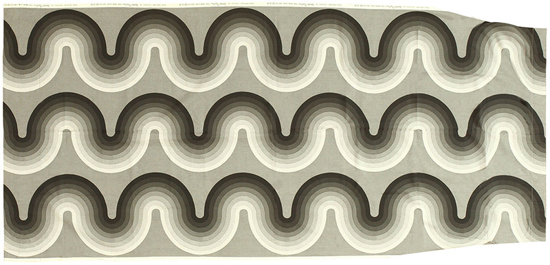
Cloud Dancer + Scandinavian and mid-century textiles
If you love Swedish, Scandinavian, or minimalist interiors, Cloud Dancer supports that clean look – but still lets the rug’s geometry and gentle palette carry the room.
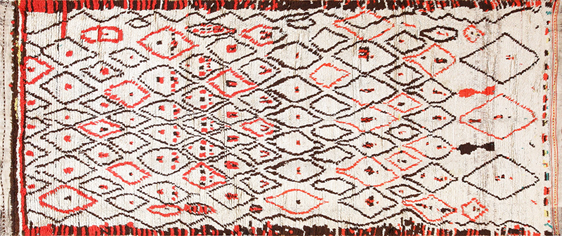
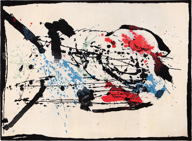
Cloud Dancer + graphic tribal rugs
Caucasian, Moroccan, and bold geometric pieces look sharp and architectural against a soft white. You get contrast without harshness.
A practical designer trick: Cloud Dancer makes rugs photograph beautifully
If you’ve ever staged a room, you know this: the wrong wall color can fight the rug. Whites that are too bright can blow out detail; whites that are too creamy can tint everything.
“Cloud Dancer – because it’s meant to feel airy and balanced – tends to be a forgiving backdrop for texture and pattern, which is why it’s already being talked about across fashion and interiors.” – Architectural Digest
Where to use it in a home (my favorite spots)
Living rooms: especially if the rug is the hero
Bedrooms: Cloud Dancer + a great rug = instant calm
Hallways: make patterned runners feel crisp
Dining rooms: let wood tones and textiles look richer
Galleries/art walls: it behaves like a quiet frame.
One caution (so you don’t get surprised)
All whites change with light.
For this reason, Cloud Dancer should be tested in morning light. Instead, they reflect vegetable dyes, oxidation, patina, abrash, age, and time.
Before committing, test Cloud Dancer in morning light, afternoon light, and evening lamplight. In some rooms, it will read “clean and airy.” In others, it can read “soft and warm.” That’s not a flaw – that’s the personality.
The takeaway
Cloud Dancer isn’t a trend color in the loud sense. This shade a foundation color – something you build on.
Cloud Dancer functions as a foundation color.
As a result, it supports rooms built on texture and proportion.
After decades of seeing what lasts, the smartest interiors stay calm above and expressive below.
Cloud Dancer gives you the calm.
The rug gives you the story.